
Golden Ratio Typography: Unlock Divine Proportions for Perfect Type Scales & Hierarchies
Imagine scrolling through a website where headlines command attention like ancient obelisks, body text flows like a serene river, and every size relationship feels instinctively right. This isn't mere chance—it's golden ratio typography, the divine proportion that has captivated artists, architects, and designers for millennia. φ ≈ 1.618, that irrational number derived from nature's spirals in nautilus shells and galaxy arms, holds the key to flawless typography hierarchy.
In design, typography isn't just letters on a screen; it's the skeleton of communication. A weak hierarchy muddles messages, overwhelms readers, or bores them into abandonment. But harness the golden ratio typography scale, and you craft mathematical harmony that elevates your work from good to transcendent. Whether you're a professional designer laying out a magazine spread, an architect specifying signage, or a digital artist perfecting UI, this guide unlocks Phi-driven precision for type scales that resonate on a visceral level.
Why does it work? Our eyes crave proportion. The golden ratio, (1 + √5)/2 ≈ 1.6180339887, creates self-similar growth that's endlessly pleasing. Multiply or divide font sizes by φ, and you build scales where each step feels like the natural next note in a symphony.
The Golden Ratio Typography Scale: Core Principles of Divine Proportion
At its heart, the golden ratio typography scale is simple: start with a base font size, then scale up (or down) by multiplying (or dividing) by φ ≈ 1.618. This creates a modular scale typography system where small text relates perfectly to headings, ensuring visual rhythm without arbitrary guesses.
Forget 1.25x or 1.333x multipliers—they're linear and forgettable. Phi's recursive magic means ratios between non-adjacent sizes (like body to H1) also approximate φ, fostering deeper harmony. Designers like Tim Brown of Modular Scale championed this, proving it outperforms ad-hoc sizing in readability tests and aesthetic appeal.
Visualize it: a nautilus shell's chambers grow by φ, each fitting seamlessly into the whole. Your type hierarchy does the same, turning flat text into a living, breathing structure.
The Definitive Golden Ratio Typography Scale Example
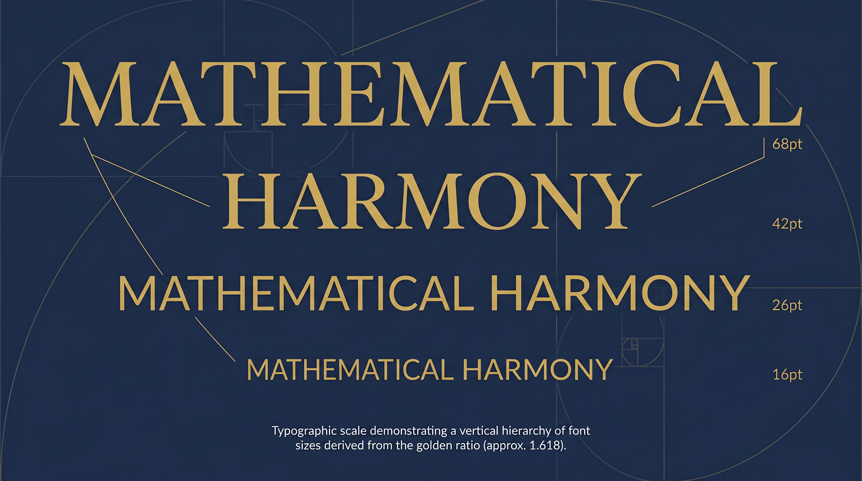
Let's anchor in reality. Start with a body text of 16px—a sweet spot for web readability on modern screens. Scale upward for headings:
| Element | Size (px) | Calculation | Ratio to Body |
|---|---|---|---|
| Body (p) | 16px | Base | 1x |
| H3 | 26px | 16 × 1.618 ≈ 25.89 | 1.618x |
| H2 | 42px | 26 × 1.618 ≈ 42.07 | 2.618x |
| H1 | 68px | 42 × 1.618 ≈ 67.96 | 4.236x |
Scale downward for captions or footnotes: 16 ÷ 1.618 ≈ 10px. Notice how H1 to body is φ² (2.618), H1 to H3 is φ—pure phi in design. Deploy this in a project, and watch user engagement soar as eyes glide effortlessly.
Building Your Custom Golden Ratio Typography Scale
One size doesn't fit all. Tailor your golden ratio typography scale to context. For mobile-first apps, base at 14px:
- Body: 14px
- H6/Small: 14 ÷ 1.618 ≈ 9px
- H3: 14 × 1.618 ≈ 23px
- H2: 23 × 1.618 ≈ 37px
- H1: 37 × 1.618 ≈ 60px
Print projects? Bump to 18px base for richer depth:
- Body: 18px
- H3: 29px
- H2: 47px
- H1: 76px
For bold editorial like posters, 20px base yields drama: Body 20px, H3 32px, H2 52px, H1 84px. Use a spreadsheet: column A sizes, B = A * 1.6180339887, round to nearest px for crisp rendering. Test at arm's length—what feels hierarchical yet balanced?
Line Height Golden Ratio: The Secret to Effortless Readability
Font size alone isn't enough. Enter line height golden ratio. Set line-height to 1.618 times font-size for vertical breathing room that mirrors Phi's horizontal magic.
For 16px body: line-height: 1.618 (≈26px). This yields 1.5–1.7x multipliers pros swear by, but Phi's precision prevents cramped or airy text. Why ideal? It aligns with saccadic eye movements—our gaze jumps φ-proportioned distances naturally.
- Body (16px): line-height 1.618 → 26px
- H3 (26px): line-height 1.618 → 42px (echoes H2 size!)
- H1 (68px): line-height 1.618 → 110px for majestic display
Result: text blocks that pulse with mathematical harmony, reducing fatigue across long reads.
Column Width and Golden Proportions for Optimal Measure
Typography hierarchy thrives in bounds. Use column width golden proportions for measure (line length): 45–75 characters max. Start with body size, scale container width by φ.
Example: 16px body at 1.618 line-height suggests 66ch ideal (≈500–600px at 16px). For multi-column layouts, divide by φ: sidebar 600 ÷ 1.618 ≈ 370px. This creates nested harmony, like fractals in a fern leaf.
Pro tip: CSS max-width: 66ch; margin: 0 auto; pairs perfectly with Phi scales.
Font Pairing with Precision Using Phi
Balancing Contrasting Typefaces
Pair serif body (e.g., Georgia) with sans-serif headings (e.g., Helvetica)? Size the heading at φ times the body for equilibrium. 16px serif body + 26px sans-serif H3: contrast pops without clashing.
For extremes—slab serifs vs. scripts—double down: script logo at φ² body size. This phi in design ensures families complement, not compete, crafting typography hierarchy that's architecturally sound.
Technical Implementation: CSS for Golden Ratio Typography
Code it scalably. In your stylesheet:
:root {
  --phi: 1.6180339887;
  --base: 1rem; /* 16px */
}

p { font-size: var(--base); line-height: calc(var(--phi)); }
h3 { font-size: calc(var(--base) * var(--phi)); }
h2 { font-size: calc(var(--base) * var(--phi) * var(--phi)); }
h1 { font-size: calc(var(--base) * pow(var(--phi, 3)); }
For fluidity, use clamp(): font-size: clamp(1rem, 4vw, 1.618rem). Swap --base for 18px print via media queries. Pure, responsive golden ratio typography.
Print vs Web Typography: Adapting Divine Proportions
Web thrives on rem/em for zoomability; print demands pt/em for ink precision. Web: 16px base scales fluidly. Print: 12pt body (≈16px), but φ multiplies yield 19pt H3—test at 300dpi.
Key diffs: Web line-height unitless (1.618); print absolute (26pt). Columns: web ch units, print picas (30pc ≈ golden measure). Architects, note: signage hybrids px/pt for vector outputs. The principle endures—adapt, don't abandon.
Embrace Mathematical Harmony: Your Next Step
Golden ratio typography isn't a trend; it's timeless truth encoded in nature. Implement these scales, and your designs will exude the divine proportion that turns viewers into admirers.
For instant mastery, dive into the GetRatioGolden calculator. Input your base size, and generate full hierarchies, line heights, and column widths in seconds. Precision awaits—unlock it today, and watch your work ascend to architectural elegance.
