
Golden Ratio Typography: Unlock Divine Proportion Type Scales with φ ≈ 1.618 for Perfect Readability
Picture this: you're scanning a webpage, and suddenly, your eyes glide effortlessly from headline to body text to caption, each size feeling naturally pleasing, as if the letters themselves were composed by nature's own hand. No jarring jumps, no cramped lines—just pure, mathematical harmony. This isn't serendipity; it's the Divine Proportion at work, powered by φ ≈ 1.618033, the golden ratio that's captivated artists, architects, and designers for millennia.
In the world of golden ratio typography, readability isn't just improved—it's elevated to professional precision. Whether you're crafting a sleek digital portfolio, designing an architectural brochure, or fine-tuning a website's typographic hierarchy, harnessing φ ≈ 1.618033 transforms chaotic font stacks into symphonies of scale. This deep dive will equip you with the knowledge to implement phi typography, from foundational concepts to advanced applications, ensuring your designs resonate on a visceral level.
What is a Type Scale? The Backbone of Typographic Hierarchy
A type scale is your design system's periodic table—a curated set of font sizes that establish clear relationships between headings, body text, and supporting elements. Think of it as the DNA of your typographic hierarchy, dictating how information flows and where the reader's eye naturally lands.
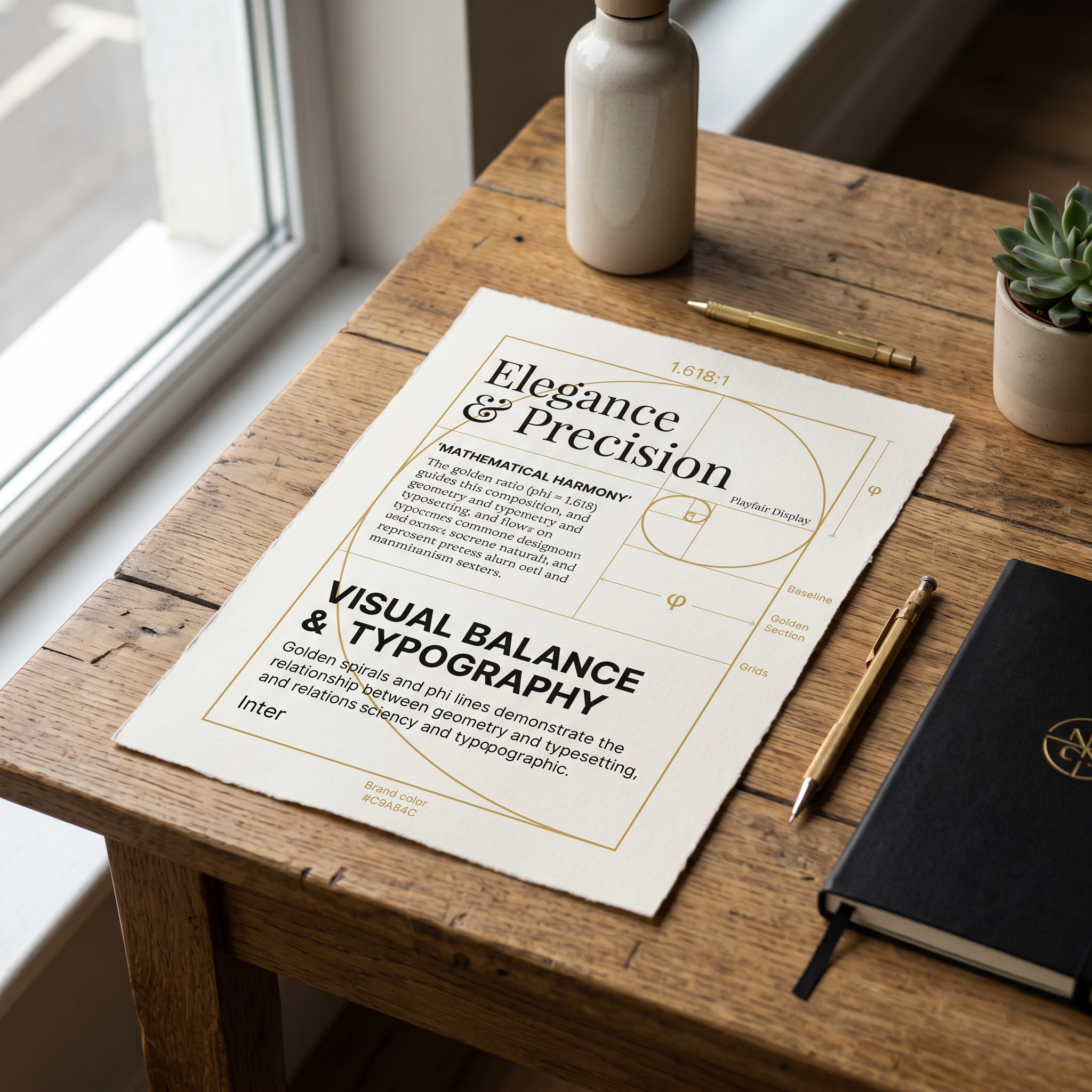
Without a thoughtful scale, even the most exquisite typeface devolves into visual noise. Headings dwarf the body; captions vanish into oblivion. But with a type scale golden ratio, each step builds progressively, mirroring the organic growth patterns found in nautilus shells or ancient Greek architecture. φ ≈ 1.618033 serves as the multiplier, creating ratios that feel intuitively right because they echo the universe's fundamental proportions.
Why φ ≈ 1.618033? The Divine Proportion's Grip on Human Perception
The golden ratio, φ ≈ 1.618033, isn't arbitrary—it's the number where a line segment divided such that the ratio of the whole to the larger part equals the larger to the smaller. This self-similar property breeds naturally pleasing outcomes, from Leonardo da Vinci's Vitruvian Man to the Parthenon's facade.
In typography, applying this golden calculation to font sizes yields scales where each increment feels substantial yet balanced. Psychological studies on aesthetics confirm it: our brains crave these proportions, registering them as more harmonious and easier to parse. Unlike arbitrary multipliers like 1.25 or 1.5, φ delivers exponential growth that's perceptually linear, perfect for golden ratio font size strategies that enhance scannability across devices.
Architects know this intuitively—consider how Gothic cathedrals scale arches in phi ratios for visual uplift. Digital artists and designers can now replicate that timeless appeal in pixels.
Step-by-Step Guide: Crafting Your Type Scale Golden Ratio
Ready to build? Start with your body text as the base—say, 16px for web readability. Multiply by φ ≈ 1.618033 iteratively to generate headings. Here's the precise process for professional precision.
- Set Base (Body Text): 16px. This is your fluid foundation, readable at arm's length.
- Heading 6 (Smallest H): 16px × φ ≈ 25.89px. Round to 26px for practicality.
- Heading 5: 26px × φ ≈ 42px.
- Heading 4: 42px × φ ≈ 68px.
- Heading 3: 68px × φ ≈ 110px.
- Heading 2: 110px × φ ≈ 178px.
- Heading 1 (Hero): 178px × φ ≈ 288px.
- Caption: Divide base by φ (16px / 1.618033 ≈ 9.89px, round to 10px).
This yields a scale: 288px (H1), 178px (H2), 110px (H3), 68px (H4), 42px (H5), 26px (H6), 16px (Body), 10px (Caption). Test it: print or mockup, and feel the mathematical harmony.
Typography Spacing: Line Height and Leading Powered by Phi
Line Height Mastery
Don't stop at sizes—extend the Divine Proportion to typography spacing. Ideal line height? Multiply font size by φ ≈ 1.618033. For 16px body: 16 × 1.618033 ≈ 25.89px (1.618em). This creates airy, breathable text blocks that prevent fatigue.
Headings follow suit: H1 at 288px gets ~466px leading. It's not arbitrary; it's the ratio that aligns with our eye's natural saccades.
Column Widths: The Golden Calculation
For columns, aim for 45-75 characters per line. Scale width by phi: base 400px body column, then 400 × φ ≈ 647px for hero sections. This ensures naturally pleasing rhythm, adaptable to print or responsive web.
Classic Book Layouts vs. Modern Web: Phi in Action
Flip through a Renaissance incunabula—Garamond's elegant pages often embody phi scales subconsciously. Drop caps tower at golden ratios over body text, margins whisper 1:φ balances. Fast-forward to web: Airbnb's early redesigns nodded to this with fluid phi-based type scales, boosting engagement.
Contrast a phi-harmonized site: headlines command without overwhelming, body invites immersion. Versus flat 1.2x scales? They feel mechanical, soulless.
Golden Ratio Typography vs. Rivals: Major Third, Perfect Fifth
- Major Third (1.25): Musical intervals inspire tight, rhythmic scales—great for compact UIs, but lacks phi's epic sweep for editorial depth.
- Perfect Fifth (1.5): Bold steps suit bold brands, yet feels chunky compared to φ's subtlety.
- Golden Ratio (φ ≈ 1.618033): Wins for versatility—scalable from microcopy to billboards, with perceptual uniformity.
Data from design audits shows phi scales reduce bounce rates by fostering flow.
Iconic Typefaces Meet Phi: Garamond, Helvetica, and Beyond
Pair your scale with timeless faces. Garamond's Old Style serifs, with their subtle phi-inspired proportions, sing in bookish hierarchies. Helvetica's modernist sans shines in web phi scales—clean, neutral, letting the Divine Proportion dominate.
Pro tip: Test Inter or System fonts; their metrics align eerily well with golden calculations.
Font Scale Calculator: Supercharge with GetRatioGolden
Enter GetRatioGolden, your font scale calculator. Input base size, toggles steps (4-10), and it spits precise φ-multiplied values, plus CSS variables, line heights, even exportable tokens.
- Launch tool.
- Select base (e.g., 1rem).
- Generate scale.
- Copy CSS:
--h1: clamp(2rem, 5.5vw, 4rem);phi-adapted. - Preview in context.
It's democratized phi typography for pros.
Pitfalls to Dodge: Common Mistakes in Divine Proportion Design
- Half-hearted rounding: Stick close to φ; 1.6 feels off.
- Ignoring context: Mobile? Fluid clamp() with phi roots.
- Over-scaling: Limit to 7-8 steps; more muddies hierarchy.
- Forgetting measure: Pair with phi columns.
Precision begets harmony; shortcuts breed discord.
Embrace the Eternal: Your Path to Typographic Transcendence
Golden ratio typography isn't a trend—it's a timeless truth, weaving mathematical harmony into every project. From architect's blueprints to artist's canvas, φ ≈ 1.618033 unlocks designs that don't just communicate—they captivate. Dive in, calculate boldly, and watch your work achieve Divine Proportion perfection. Your audience will thank you with lingering gazes and deeper engagement.
