
Golden Ratio in Logo Design: Unlocking Phi & Fibonacci Secrets in Iconic Brands Like Apple and Pepsi
The Timeless Allure of the Divine Proportion
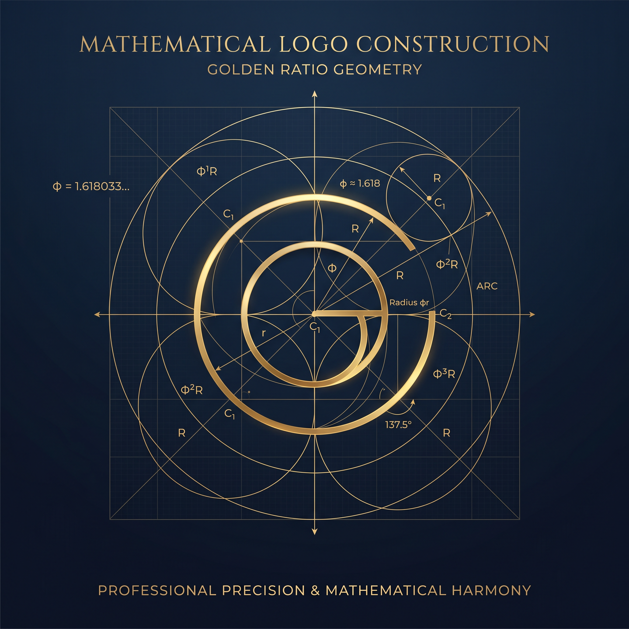
Imagine a simple silhouette that stops you mid-scroll, drawing your eye with effortless grace. Why does it feel just right? The secret often lies in the golden ratio, an ancient mathematical principle known as the Divine Proportion, denoted by the Greek letter φ (phi), where φ ≈ 1.618033. This irrational number, emerging from the ratio of two quantities where the whole is to the larger as the larger is to the smaller, has captivated artists, architects, and now, master logo designers.
In logo design, the golden ratio isn't mere decoration—it's a psychological powerhouse. Our brains are wired to find design proportions based on φ inherently harmonious, echoing patterns in nature like nautilus shells, sunflower seeds, and human anatomy. When brands embed this into their visual identity, logos transcend trends, achieving timeless appeal. Enter the Fibonacci sequence logo techniques and logo construction grid methods that power icons we recognize instantly. This deep dive unravels how Phi branding elevates everyday marks into cultural touchstones.
Decoding Iconic Logos: Where Math Meets Mastery
Apple: The Bite That Bites Back with Precision
Rob Janoff's 1977 Apple logo revolutionized simplicity, but beneath its curves hides a golden ratio in logo design marvel. The iconic bite isn't arbitrary—its size and position align with φ proportions. If you overlay a logo construction grid, the apple's width to height follows a golden rectangle (1:φ). The leaf stem and bite curve trace Fibonacci spirals, creating organic flow. This subtle harmony makes the logo feel alive, balanced, and universally approachable, fueling Apple's brand as innovative yet human.
Twitter (Now X): The Bird's Geometric Flight Path
The original Larry the Bird logo, crafted by Biz Stone-inspired design, was built on interlocking circles sized via the Fibonacci sequence logo. Starting with a unit circle, subsequent rings expand by Fibonacci numbers (1, 1, 2, 3, 5...), approximating φ. The bird's wing arcs and tail feathers emerge from this spiral grid, giving dynamic motion within stillness. Even the 2023 X rebrand echoes circular design proportions, proving φ's adaptability in evolution.
Pepsi: Circles in Cosmic Harmony
Pepsi's evolving globe logo masterfully employs overlapping circles where diameters relate by φ. The central 'eye' circle's radius is 1, the surrounding ring φ, creating a hypnotic ripple effect. This Phi branding not only evokes refreshment but ensures scalability—from cans to billboards. Designers dissect it via golden ratio in logo design templates, revealing how the negative space pulses with mathematical rhythm, mirroring bubbles in a fizzy drink.
National Geographic: Framing the World in Gold
Since 1888, the yellow frame screams exploration, its rectangular proportions a textbook golden rectangle: width to height = φ. Inside, the serif text nests perfectly within subdivided φ sections. This logo construction grid imparts stability and expansiveness, inviting viewers into endless discovery. It's a reminder that design proportions can encapsulate a century of storytelling without a single image.
Toyota: Ovals of Engineered Balance
Toyota's three ovals—interlocking to form a bullet-like emblem—harness φ in their eccentric overlaps. The inner oval's tilt and spacing derive from golden spirals, symbolizing heart, product, and progress. When mapped on a Fibonacci sequence logo grid, the intersections hit φ sweet spots, yielding forward momentum. This precision underscores Toyota's reputation for reliable, harmonious engineering.
BP: Sunflower's Spiral Energy
The 2008 Helios rebrand draws directly from Fibonacci sequence logo spirals, mimicking sunflower seed patterns. Radiating segments follow φ arcs, transitioning green to yellow for eco-vitality. This organic golden ratio in logo design feels approachable yet powerful, aligning BP's modern identity with nature's efficiency.
Adidas: Stripes Stacked in Proportion
The Trefoil logo's three overlapping circles shrink by φ factors (radii: 1, 1/φ, 1/φ²), forming clover-like symmetry. Stripes in Performance logos stack as golden rectangles, height:width = φ. These Phi branding elements convey speed and unity, scaling flawlessly across sportswear.
Building Your Own: A Step-by-Step Golden Grid Guide
Ready to infuse your designs with φ magic? Start with a logo construction grid. Here's a practical blueprint for professionals:
- Draw a Square Baseline: Begin with a 1x1 square. This anchors your canvas.
- Extend to Golden Rectangle: Add a φ-length rectangle (use φ ≈ 1.618). Tools like Adobe Illustrator's golden spiral plugin simplify this.
- Subdivide with Spirals: Place quarter-circles at each corner, connecting via Fibonacci sequence (1,1,2,3,5...). Curves guide organic shapes.
- Position Key Elements: Align icons, text baselines to grid intersections—eyes, bites, wings snap to φ points.
- Scale and Test: Verify ratios hold at 16x16px to billboard sizes. Pro tip: Use 'GetRatioGolden' calculator for instant A, B, Total values (e.g., input side A=100, get B=161.8).
- Refine Negative Space: Ensure whitespace follows φ divisions for breathing room.
This method transforms sketches into scalable masterpieces, blending golden ratio in logo design with your creative voice.
Pitfalls of the Pros: Avoiding Ratio Forcing
Even experts stumble. The cardinal sin? Ratio forcing—shoehorning φ where curves demand otherwise. Logos like early FedEx arrow flirts with φ but prioritizes concept. Forcing distorts readability, making marks feel contrived. Instead, let grids inspire, not dictate. Over-subdivision clutters; ignore cultural contexts where φ reads differently. Test with focus groups: Does it naturally please? Iterate ruthlessly.
Remember, Phi branding enhances, never enslaves. Balance math with intuition for enduring impact.
Harmony in Every Pixel: The Phi Legacy
From Apple's orchard to Pepsi's fizz, the golden ratio weaves mathematical harmony into logos that endure. By mastering Fibonacci sequence logo grids and design proportions, you unlock designs that resonate on a primal level—naturally pleasing, universally magnetic. Next project, channel φ. Your audience will thank you subconsciously.
In the universe of design, φ isn't a tool—it's the universe's whisper.
